How CSS Positioning Works
Before learning about how CSS positioning works, let's understand why positioning is important. As you know, by default, HTML elements appear on the webpage in the same sequence as they are in the HTML code. HTML doesn't have that high level of functionality with which it can set the position of an element with precision.
To overcome this obstacle, we use the CSS property position. The position property specifies the type of positioning method used for an element. There are 5 values of the CSS position property :
-
Static
-
Relative
-
Absolute
-
Fixed
-
Sticky
To determine the final location of positioned elements, there are 4 properties: top, right, bottom and left. These properties will not work unless the position property is set first. They also work differently depending on the position value. Let's go through each value of CSS Position properties.
Static
HTML elements are positioned static by default. Elements appear according to the normal flow. In this position value, those four properties, top, right, bottom, left, will not work.
Relative
It positions the element relative to its normal position and will leave a gap at its normal position. In this position value top, right, bottom, and left will work. To understand it more precisely, let's see some code.
This is the HTML code which I am going to use for relative, absolute and fixed position.
<!DOCTYPE html> <html lang="en"> <head> <meta charset="UTF-8"> <meta http-equiv="X-UA-Compatible" content="IE=edge"> <meta name="viewport" content="width=device-width, initial-scale=1.0"> <title>CSS Position</title> <!-- CSS --> <link rel="stylesheet" href="style.css"> </head> <body> <div class="container"> <div class="box" id="box1"></div> <div class="box" id="box2"></div> <div class="box" id="box3"></div> <div class="box" id="box4"></div> </div> </body> </html>
Similarly, this is the CSS code which I am going to use for relative, absolute and fixed position.
.container{ height: 640px; background-color: #383CC1; margin: 30px; } .box{ display: inline-block; border: 2px solid black; width: 250px; height: 250px; margin: 30px 20px; background-color: #F7CD2E; }
This will generate the webpage shown in the picture below.
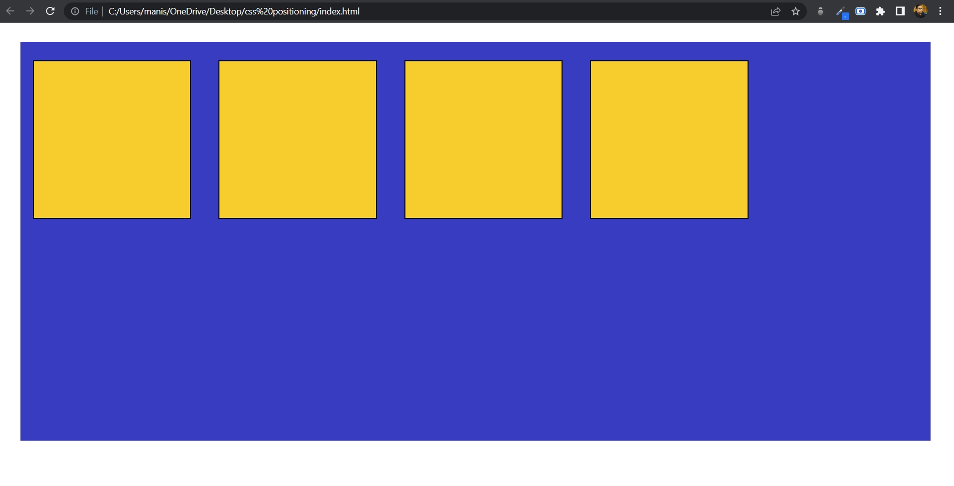
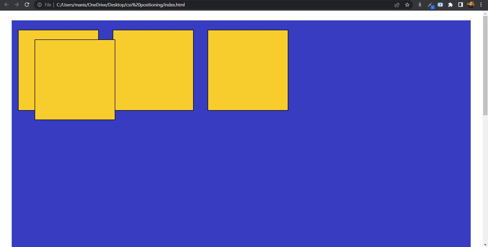
As you can see in the above picture, there are four yellow boxes inside a blue container, which itself is inside the body of the webpage. Now let's target the third box by setting its position relative.
#box3{ position: relative; top: 30px; left: 90px; }
So I set its position to relative and moved it from its original position by giving top value 30px and left value 90px. So the third box moved relative to its original position, as you can see in the picture below.
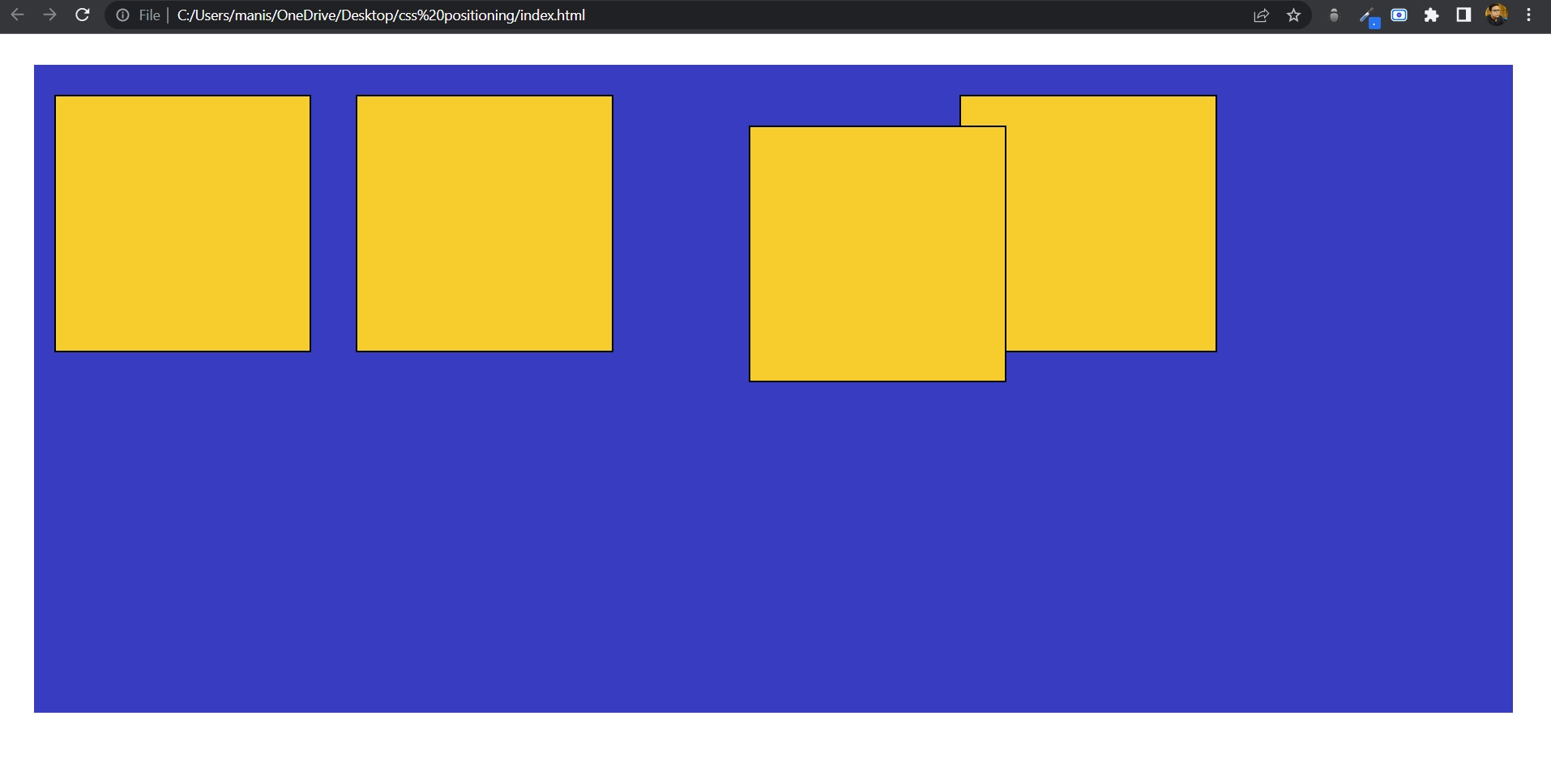
So, relative position changes the position of an element from its original position and works relative to it.
Absolute
It positions the element relative to the first parent. If an absolute positioned element has no positioned ancestor, it uses the document body, and moves along with the page scrolling.
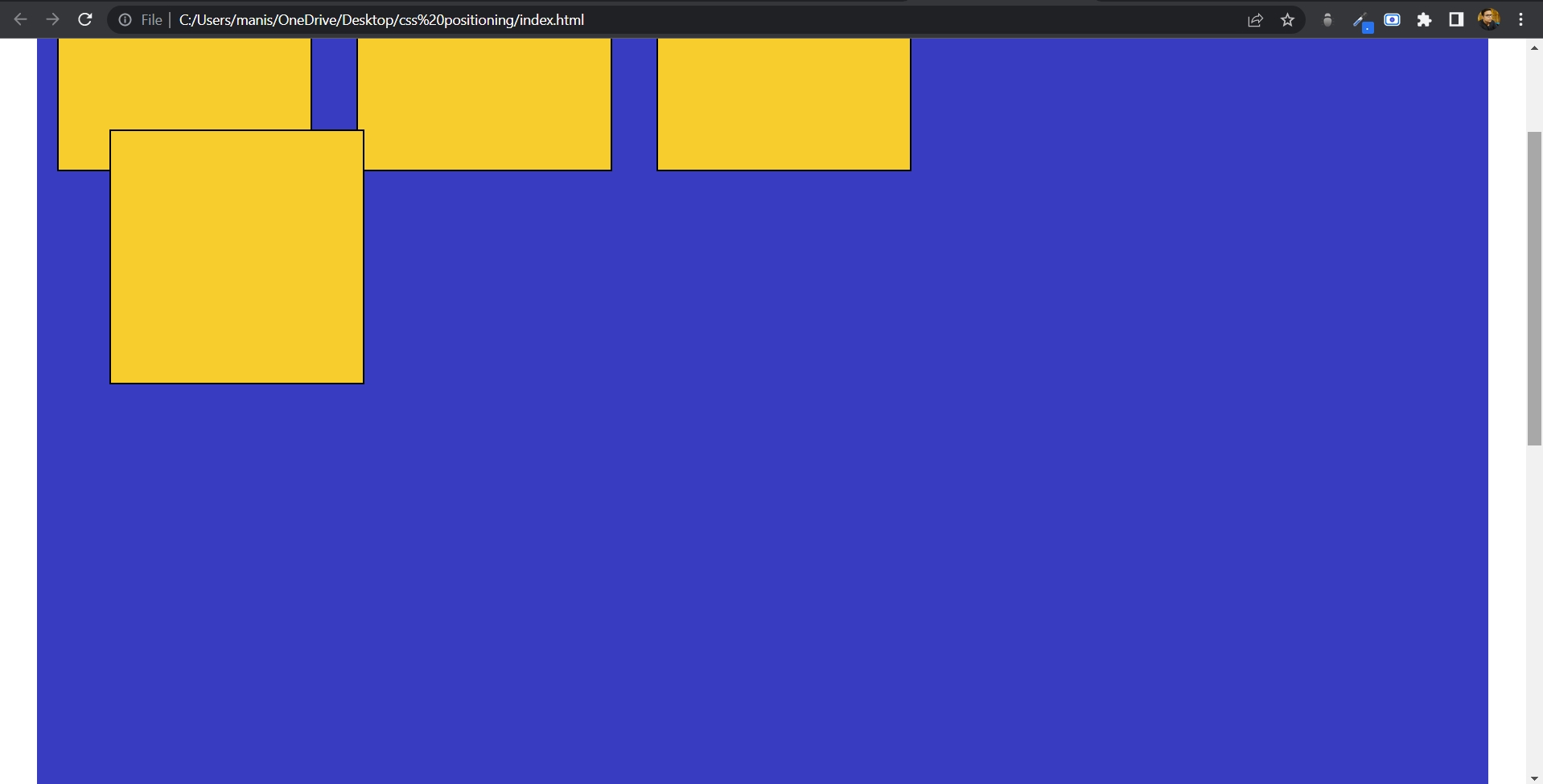
Let's again target the third box by changing its position property to absolute.
#box3{ position: absolute; top: 60px; left: 90px; }
So I changed its position to absolute and moved it 60px from the top and 90px from the left. It will create the following changes.
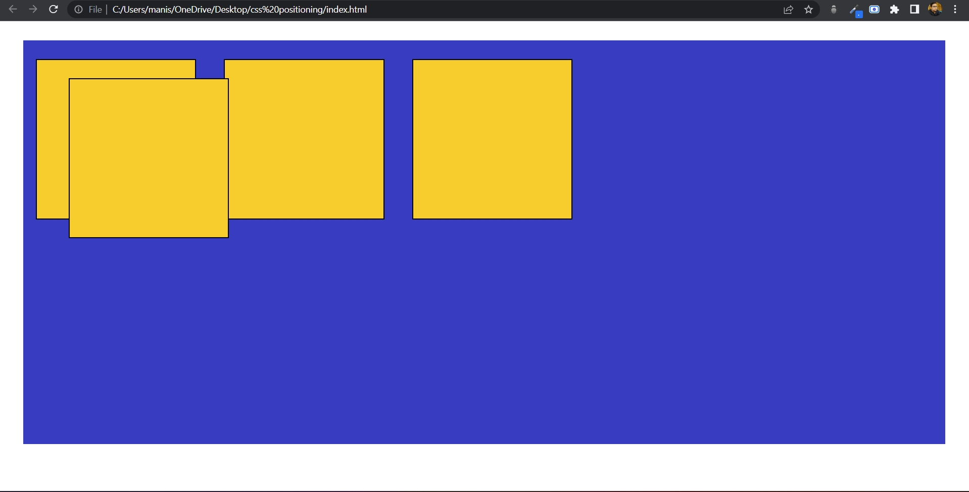
Now, what's happening here is that the third box has not changed its position from its original place; instead, it changed its position with respect to the container element (blue box). It moved away from the top by 60px, but not from its original position, but from the border of the container. If that container was not there then it would have chosen the document body as the parent element. So, that's how the absolute position property works.
Fixed
It positions the element relative to the browser window. Elements with position fixed always stay in the same place, even if the page is scrolled. Let's understand by changing the position property of the third box to fixed. But before doing that, we have to increase the height of the screen to make the webpage scrollable. So let's change its height from 640px to 1640px.
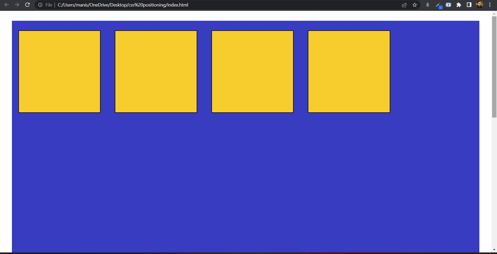
As you can see, the scroll bar has appeared on the right side of the screen. Now, let's make the position of the third box fixed.
#box3{ position: fixed; top: 60px; left: 90px; }
As you can see, the moment I changed its position to fixed, it changed its position relative to the browser window.
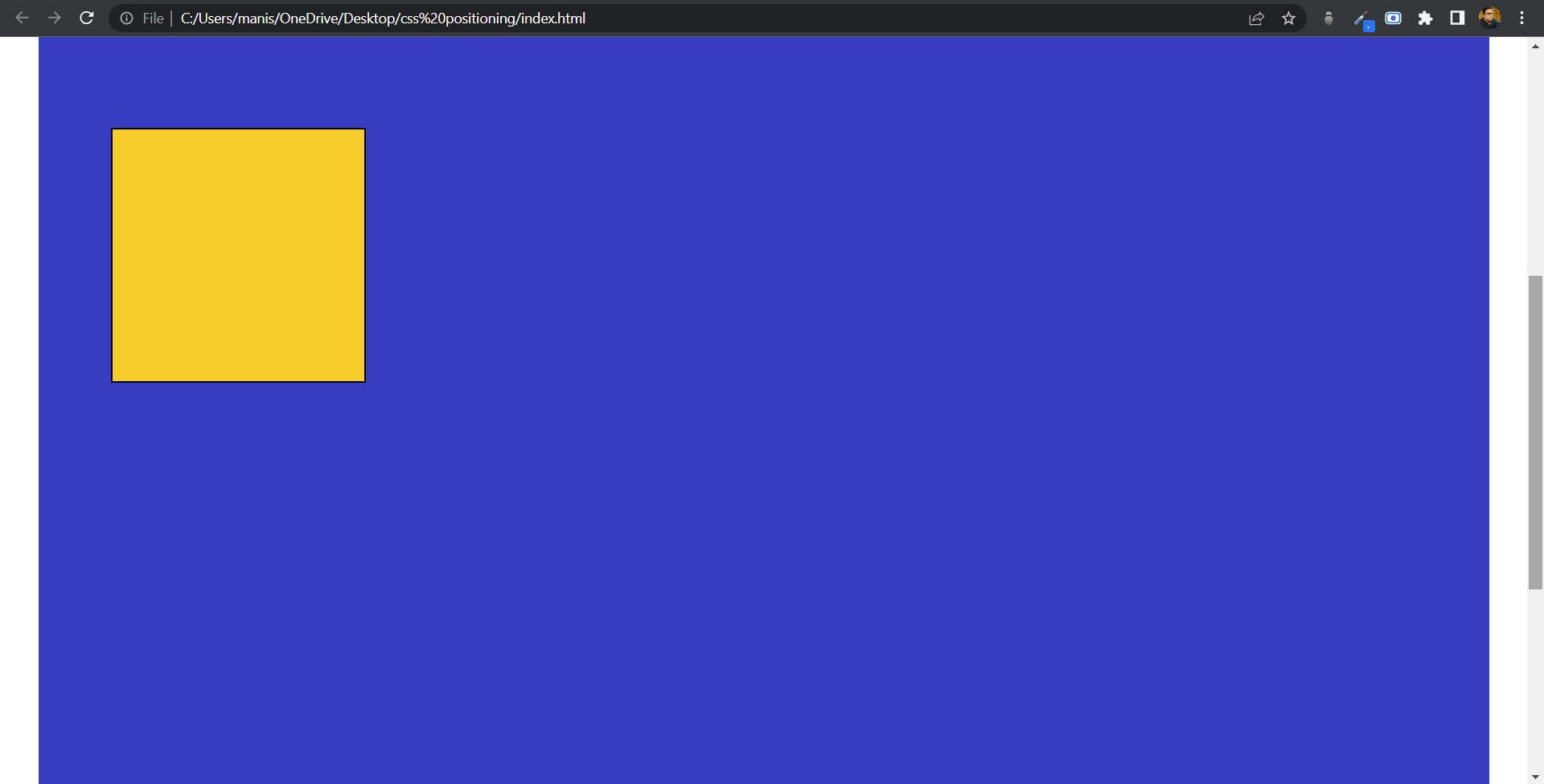
As you can see, the third box got fixed to its changed location relative to its browser window. No matter how much we scroll, it won't move even by one pixel. That's how fixed position property works.
Sticky
It allows the element to stick when the scroll reaches a certain point. It keeps the element stuck at the top or at any desired location as per the given value. The best part is, since it acts as a relative position element, we no longer need to apply a margin to the stuff that comes after it.
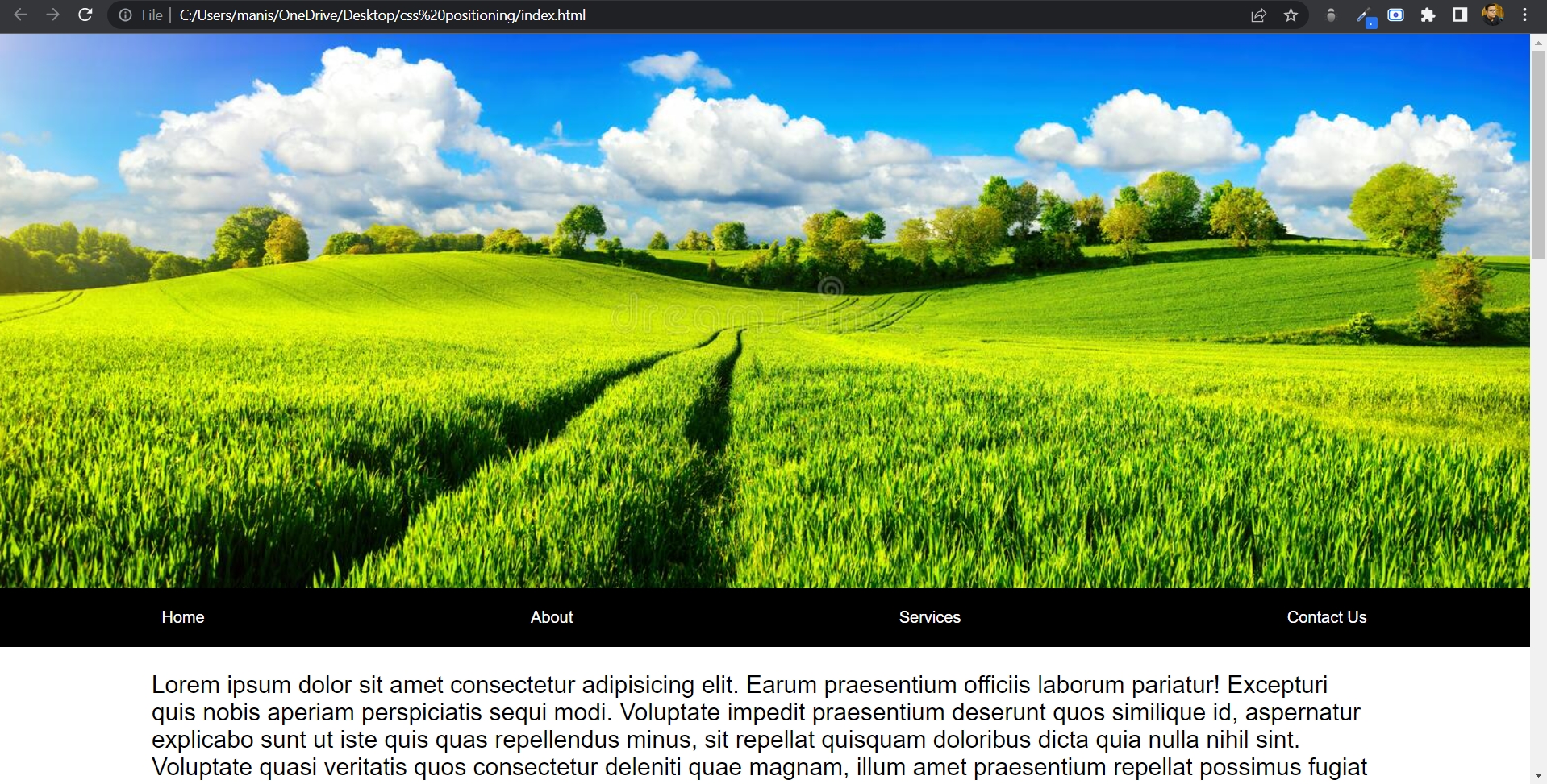
As you can see in the above picture, the navigation bar is just below that picture. Now we will change the position property of navigation to sticky.
.nav{ position: sticky; top: 0; }
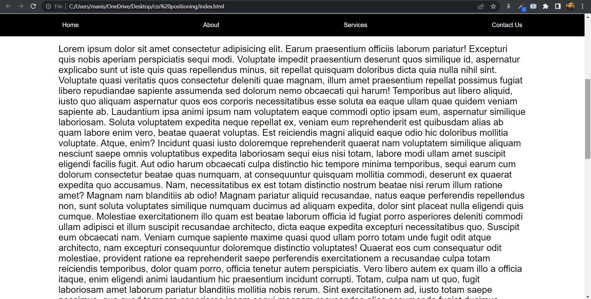
As you can see in the above picture, after giving the position property of the nav element to sticky, the moment it touched the top of the document body, it got stuck at the top. And that happened because I have set the value of top 0. Click on this link to see it functioning in video form.
One thing to note about sticky position is that not all browsers currently support sticky position. Only around 90% of browsers support it, and that is only if you prefix it as well. In order to prefix the element, you need to use these prefixes.
.nav{ position: sticky; position: -webkit-sticky; position: -moz-sticky; position: -ms-sticly; position: -o-sticky; top: 0; }
Now, to get around the remaining 10% of browsers that don't support it at all, even with the prefix, what you need to do is to add a support property for your CSS.
@supports (position: sticky){ .nav{ position: sticky; top: 0; } }
After doing this, those browsers which don't support sticky elements will just get a relative element just like normal.
So, these are the five CSS position properties which come so handy for us while designing the webpage.